Basic structure and layout of the IoT platform
In this chapter, we take a brief look at the basic structure and layout of our IoT platform. As we use similar components in many areas, it is worth getting to know them first in order to work effectively with the platform and successfully implement your IoT projects.
Overview of the platform structure
Our IoT platform has been designed to provide an intuitive and efficient user experience. To give you a visual idea of our platform, here is a simplified representation of the layout:
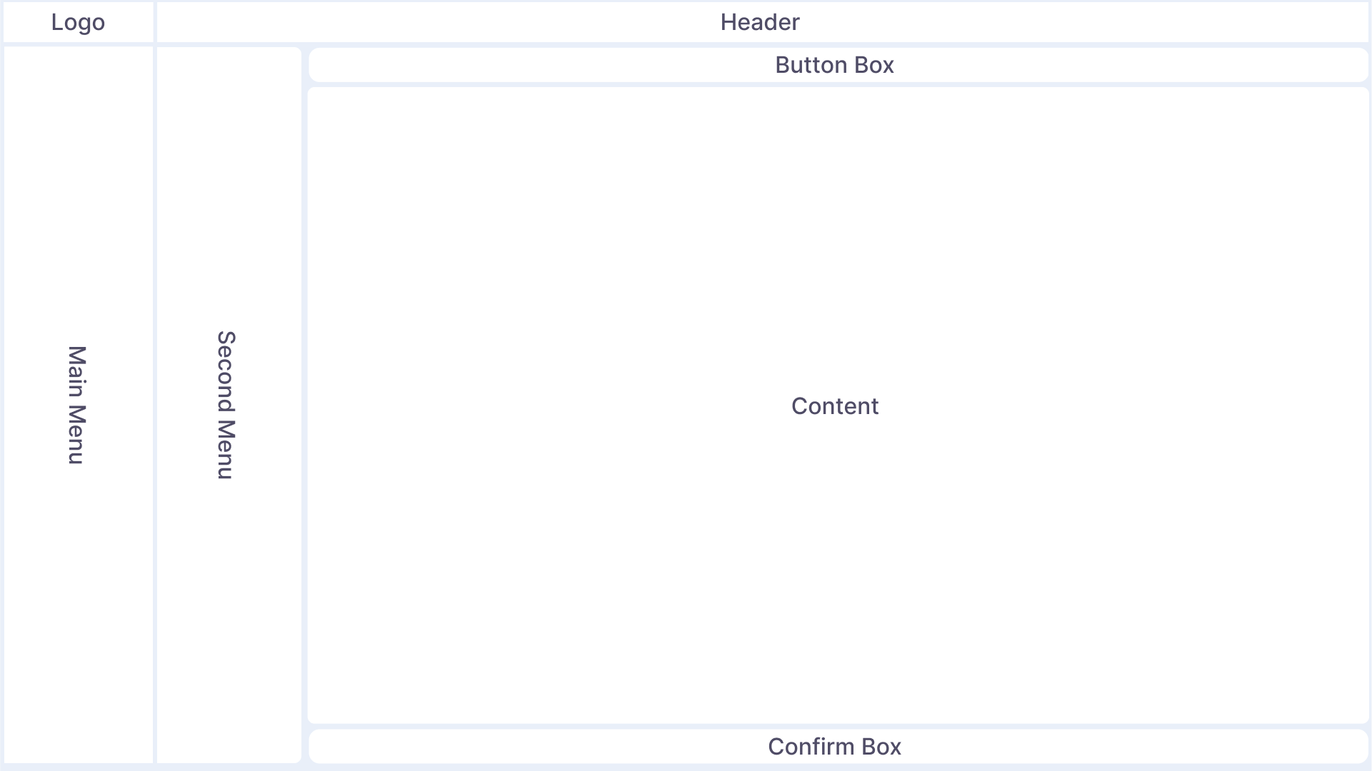
This illustration shows the basic arrangement of the individual components. The layout may vary depending on the page called up, but is based on the structure shown above.
Main menu bar
The main menu bar is located on the left-hand side of the user interface and is the hub of your navigation. It contains various menu items that can vary depending on the platform's functions and modules. In the header area of the menu bar you will find the company logo, which identifies the platform and represents your branding. The logo area can be folded out towards the bottom, which opens a small information area that shows you the current project in which you are logged in, as well as the time zone set in your profile in which the date and time information is displayed. The main menu can be displayed in different ways depending on user preference. You can switch between the different modes by pressing the button in the header directly to the right of the main menu.

- Fully expanded (displacing / overlaying)
- Icons only (displacing / overlaying)
- Fully collapsed
Header bar
The header is located at the top of the screen. Here you will find various icons that represent basic functions, as well as breadcrumbs that make navigation easier. The icons in the header are global and always the same; the functions behind them can be called up from any subpage. However, the icons shown here may differ from those shown in the application, depending on the user authorizations set.
From left to right:
-
As already mentioned, the first button is responsible for switching between the different modes of the main menu
-
The Favorites button can be used to store "favorites" to make navigation for frequently visited subpages even faster. External links can also be stored here
-
Breadcrumbs are used for navigation and always show the current subpage you are on. By clicking on the individual components of the respective breadcrumb, you can navigate quickly and easily "back" if you want to switch back to the level above the current subpage.
-
The full screen button can be used to switch to full screen mode.
-
The notification center displays current messages and information. The icon is highlighted in red when new, as yet unread messages have been received.
-
The Settings button takes you to the tenant-wide settings. This button is generally not available to users with elevated user authorizations and is not visible to every user.
-
The profile menu provides basic information about the current tenant, as well as the software version, links to documentation, the option to view and change your profile, and the option to switch between projects or tenants. The logout is also located here.
Action bar
The action bar is located directly below the header. The action bar is a dynamic area that can change depending on the page you are viewing. Here you will find interactive buttons and buttons that perform specific actions on the current page. These buttons are designed to make user interaction easier and more efficient. In general, the left side of the action bar contains buttons that are always available regardless of any selection options, while the right side of the action bar contains buttons that are used for multiple selection operations. These are sometimes inactive if no multiple selection objects have been selected.
Secondary menu
In some of our pages, there is a secondary menu to the right of the main menu for navigating within an area. This secondary menu can also be collapsed to enlarge the content area.
Content area
The content area is the central area of the user interface. Information, data and content are displayed here. The content of this area can vary depending on which functions or data you are currently using. This area is the focus of all your activities and displays all the information available for your IoT project.
Confirmation box
In some subpages of the platform, changes to the settings or other editable functions must be explicitly confirmed or rejected. When such a subpage is reached, this confirmation box appears with its options to reject or accept the changes.