Dashboards
Dashboards
Dashboards in optiCLOUD allow you to create interactive visualizations for devices, systems, and other data sources. They are used to consolidate measurement values, statuses, and actions in a fully customizable interface.
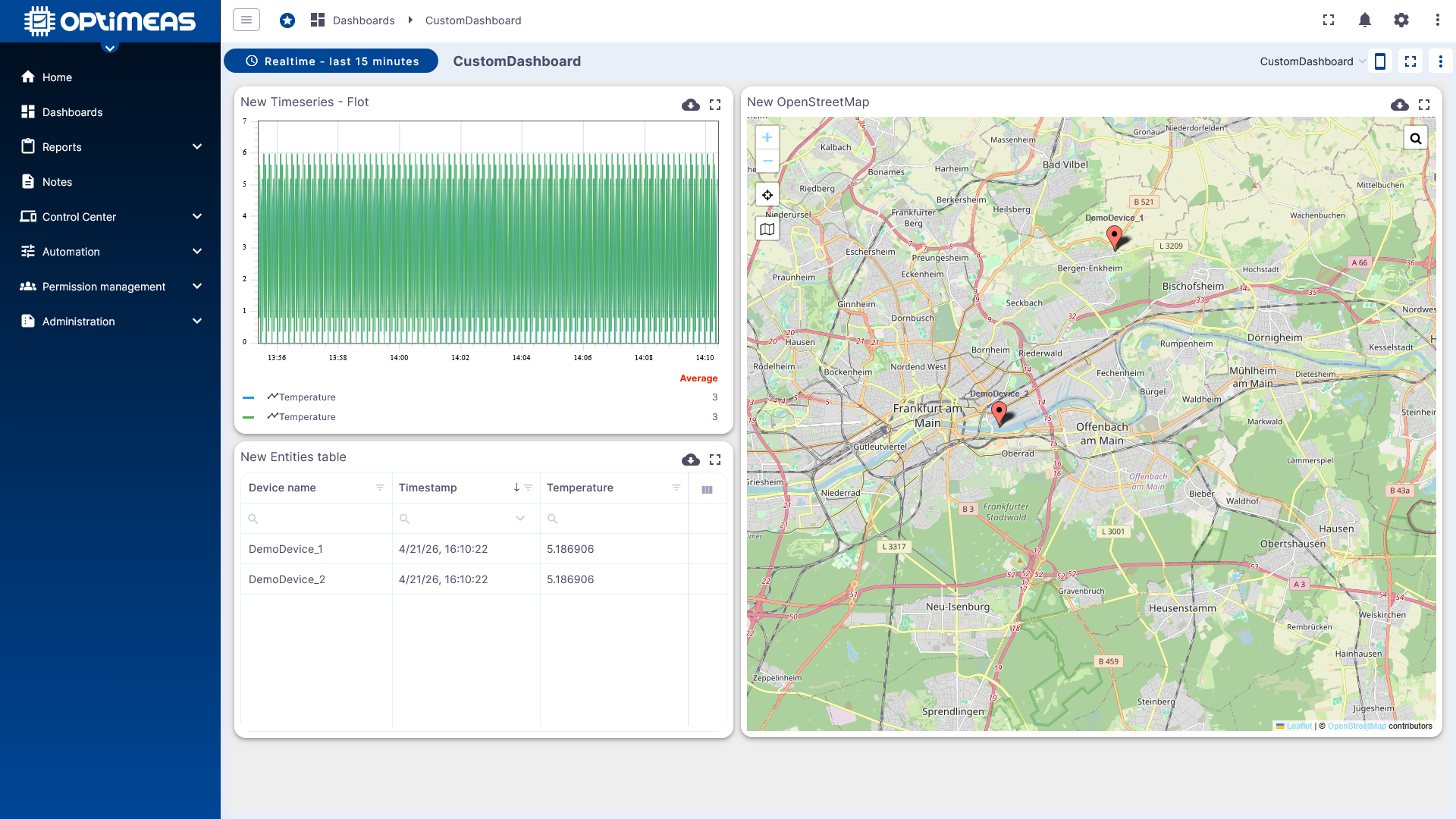
A dashboard consists of a layout with any number of widgets. This allows data to be displayed in a wide variety of formats, such as charts, tables, maps, status indicators, or control elements.
Applications
In practice, dashboards cover several tasks simultaneously:
- Data visualization for telemetry, attributes, and historical data
- Device control via control widgets, RPCs, or attribute changes
- Interactive navigation within a dashboard or between multiple dashboards
- Custom design of layout, colors, fonts, and behavior
- Role-based access via projects and permissions
- Public sharing for presentations or external views via link
- Custom widgets via the integrated Widget Library
This makes dashboards suitable for technical monitoring as well as for user interfaces, presentation views, or customer-specific analyses.
Dashboard Overview
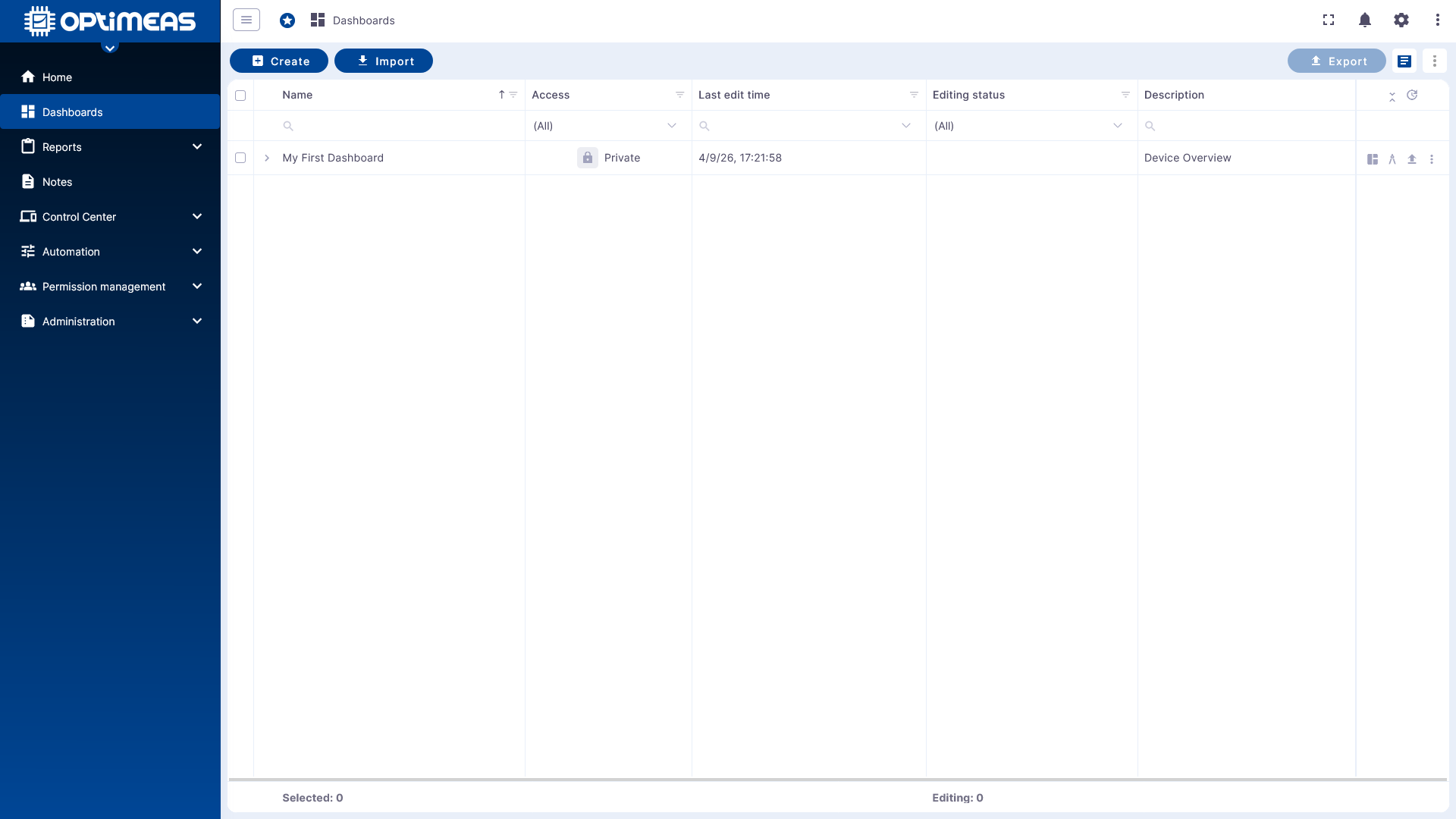
The dashboard table lists all dashboards for the currently selected project. Key status information and available actions are displayed for each dashboard.
The following information is available in the overview:
| Column | Name | Description | Access | Last Edited | Edit Status |
|---|---|---|---|---|---|
| Explanation | Name of the dashboard assigned during creation (editable) | Descriptive text for the dashboard assigned during creation (editable) | Access status of the dashboard | Time of the last edit of the dashboard | Current Edit status |
Dashboards can be managed directly via the action columns:
- Edit name or description
- Open dashboard
- Open dashboard directly in edit mode
- Export dashboard
- Delete dashboard
In the upper-left area, you can create new dashboards or import existing ones.
In the upper-right area, multiple dashboards can be selected simultaneously and exported or deleted in bulk.
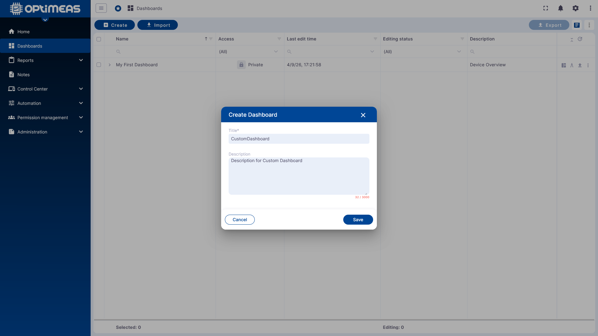
For new dashboards, only a name and, optionally, a description are required.
Dashboard Status
Edit Status
Dashboards may or may not be in edit status. A dashboard can only be edited by one user at a time. This prevents conflicting changes. If an edit is not properly completed, the session is automatically released after 15 minutes.
Visibility Status
-
private
- Access to the dashboard is restricted to users who have an active account in the current tenant.
-
public
- Access to the dashboard is granted to anyone who has the corresponding public link and uses it to access the dashboard.
Further restrictions regarding the visibility of dashboards and their data can be found at: Permission Management
Empty Dashboard and Basic Structure
After opening a newly created dashboard, only the empty layout is initially visible. Time windows, aliases, states, and widgets are configured from here.
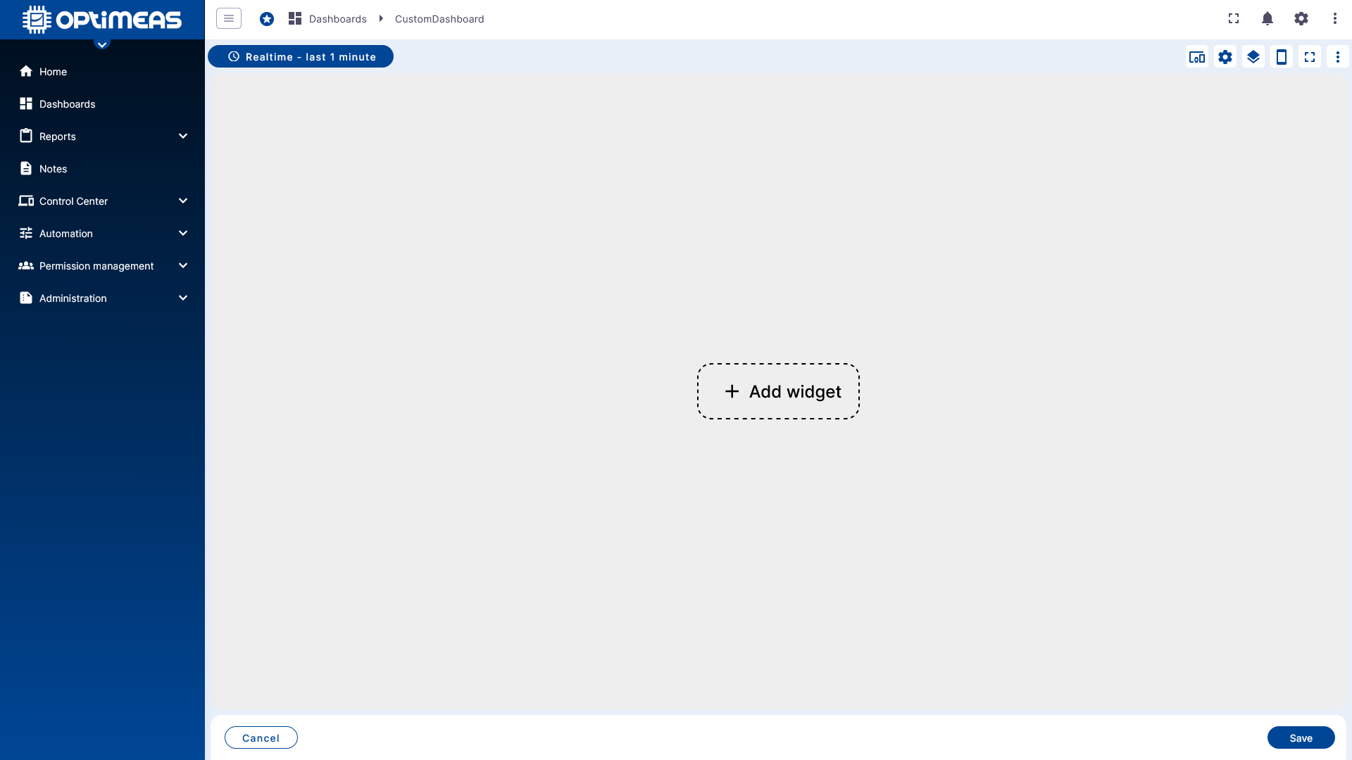
The selection for the displayed time window is located in the upper left area. Additionally, you can specify there whether and how incoming data is aggregated before display.
Time Window and Aggregation
Dashboards can work with both live real-time data and fixed historical time periods.
Real-time
In Real-time mode, the selected time window is dynamic. The dashboard updates continuously and displays new incoming values immediately.
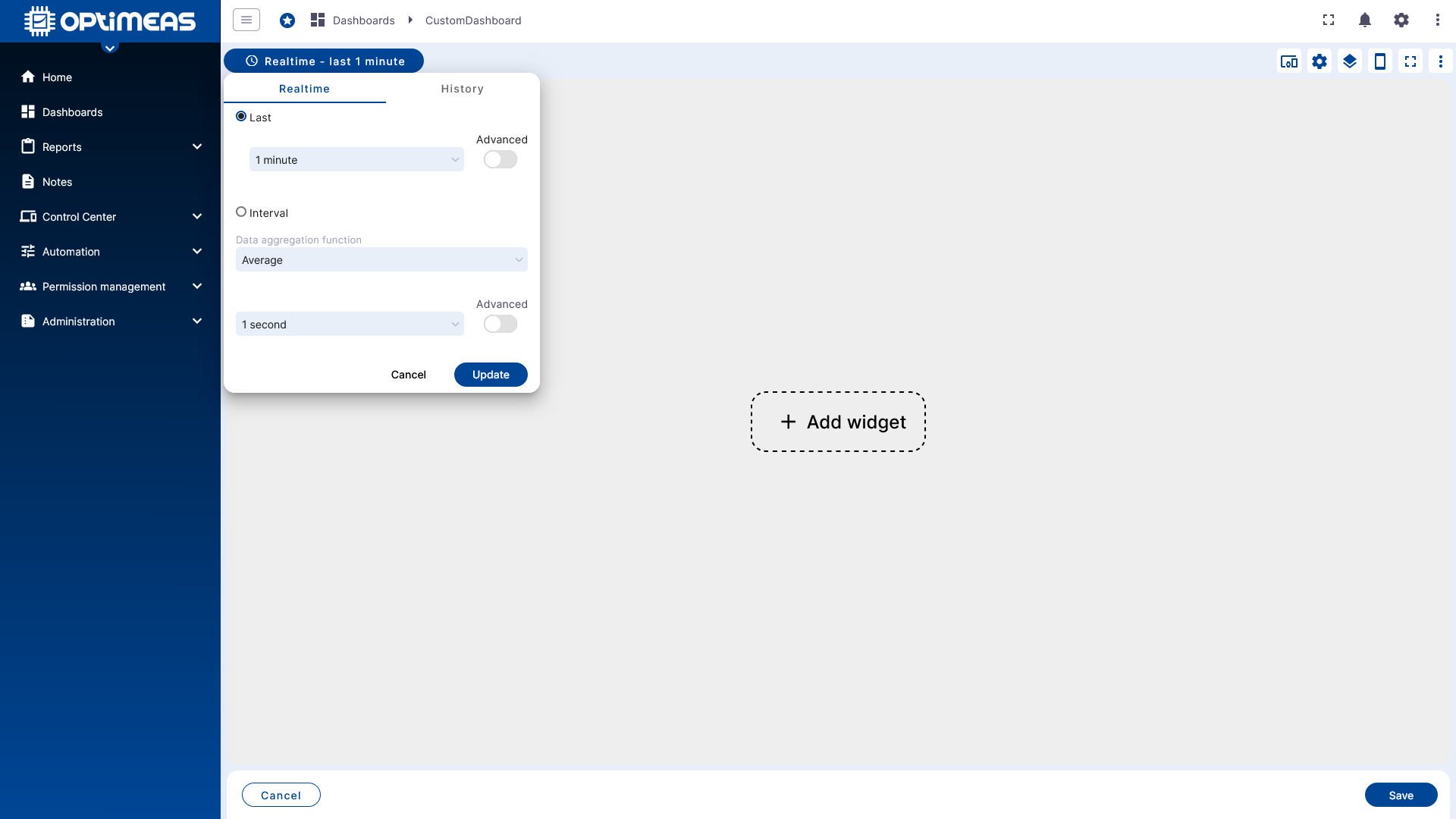
History
In History mode, the time period is static. Only data for the explicitly selected time period is loaded and displayed.
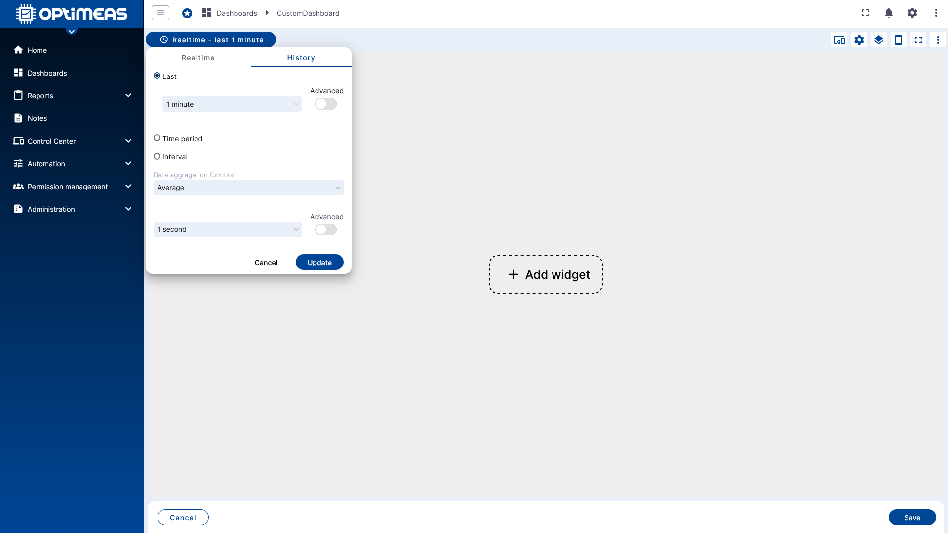
For both Realtime and History, fixed ranges or dynamic time periods can be selected, for example: last 5 minutes, last day, today, yesterday, May 17, 2025, 12:00 PM – May 17, 2025, 12:30 PM, etc.
Additionally, aggregation functions are available:
- None for raw data
- Average for the simple average of the raw data
- Sum for the sum of the raw data
- Min for the minimum of the raw data
- Max for the maximum of the raw data
- Count for the number of received values of the raw data
For all aggregation types except None, an aggregation interval can also be set. This means that data is not aggregated into a single value over the entire period, but is calculated in blocks.
Examples:
- Average with an aggregation interval of 5 seconds calculates averages of the selected time window in 5-second intervals
- Min with an aggregation interval of 300 seconds calculates the respective minimum of the selected time window in 5-minute intervals
Large time windows combined with very detailed aggregation functions, especially None, can result in significant loading times. For a 7-day period and a data rate of 1 Hz, this already results in approximately 600,000 data points per channel. With multiple devices or channels, the amount of data to be processed increases correspondingly. In this context, data transmission is usually not the problem; rather, it is the "plotting" of the data in the respective widgets (e.g., maps or charts) that can cause significant delays.
Toolbar and Dashboard Functions
The editing toolbar is located in the upper-right corner of the dashboard. Key dashboard settings are managed from here.
Aliases
An alias is a reference to a single device or a group of devices. Widgets do not work directly with individual devices, but rather through alias definitions.
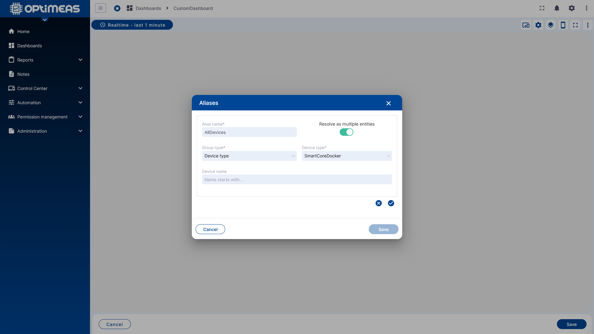
Aliases can be static or dynamic. Available types are:
- Single Device as a static reference to exactly one device
- Device List as a static reference to multiple devices
- Device Name as a dynamic reference to a device based on its name
- Device Type as a dynamic reference to devices of a specific type
- Current Project as a reference to all devices in the current project
- From Dashboard State as a dynamic reference based on the Dashboard States
A clearly defined alias is the first step before a widget can be configured properly.
Settings
The Dashboard Settings define the global properties of the dashboard.
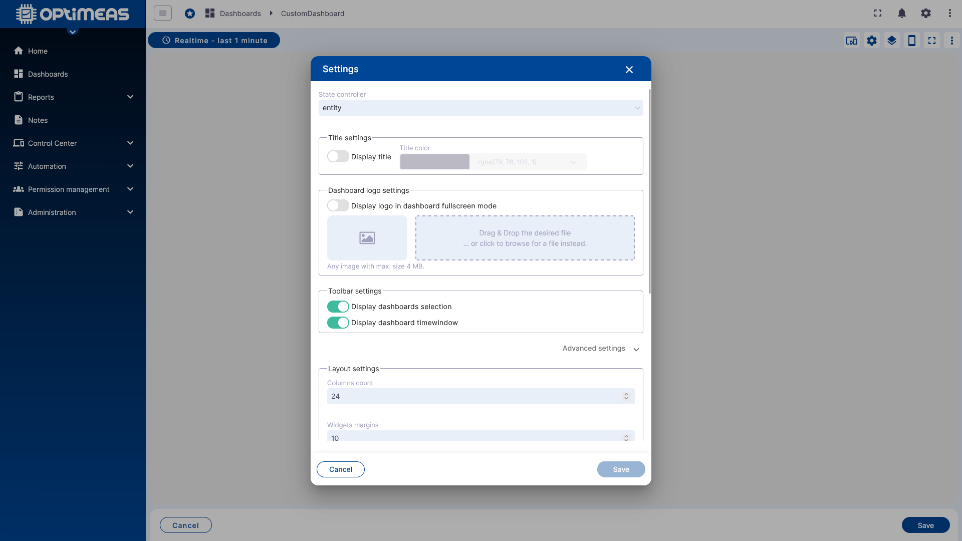
These include:
- Title and color
- Logo
- Visible toolbar elements
- Background
- Mobile settings
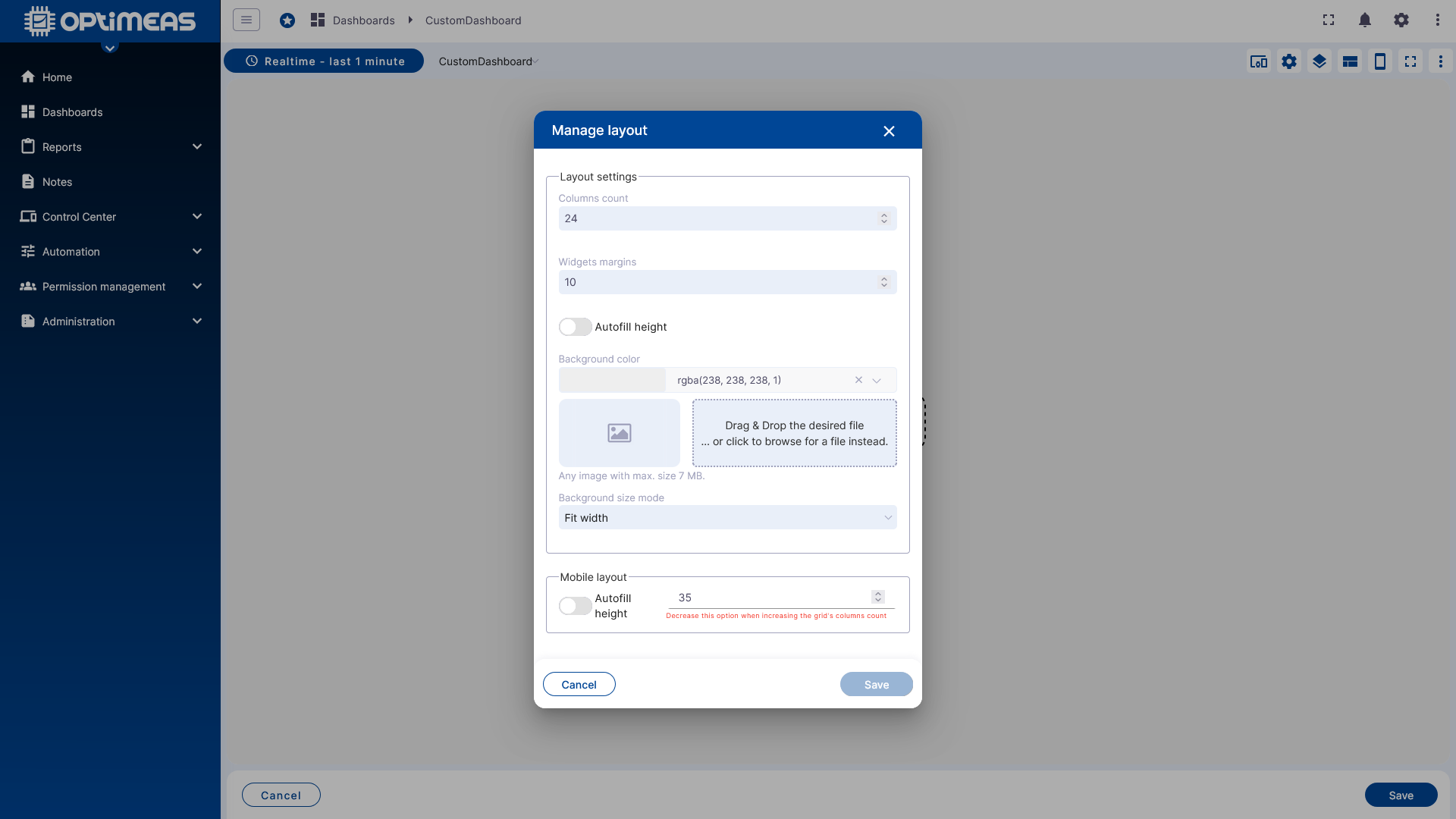
- Autofill behavior
With Autofill, widgets can automatically fill the available space instead of being limited to a manually set position.
The layout itself is also defined globally:
- Number of columns
- Spacing between widgets
Additionally, you can specify which menu items or controls should be visible in the dashboard interface.
States
A dashboard can consist of multiple states. States function similarly to worksheets in an Excel file: They belong to the same dashboard but can represent different views or work steps.
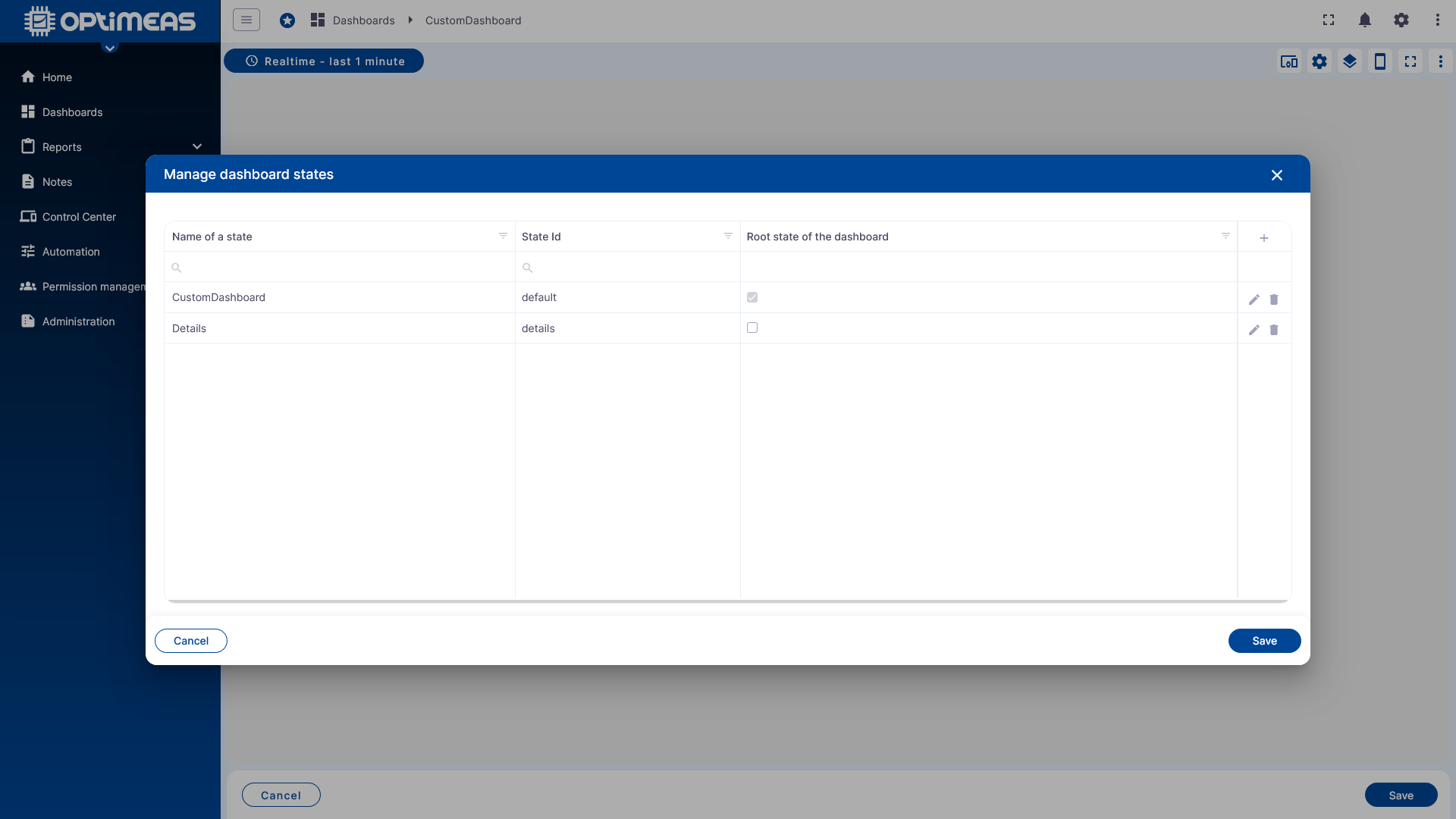
States can be linked to one another. This allows a dashboard, for example, to switch from an overview page to a detailed view or to focus on different devices depending on user actions.
Additional Toolbar Functions
The toolbar also offers the following functions, among others:
- Preview of the mobile layout
- Full-screen view
- Switch to edit mode
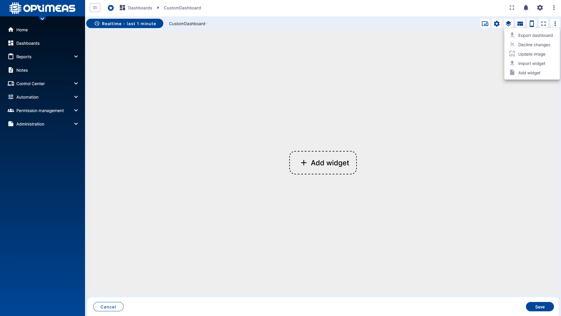
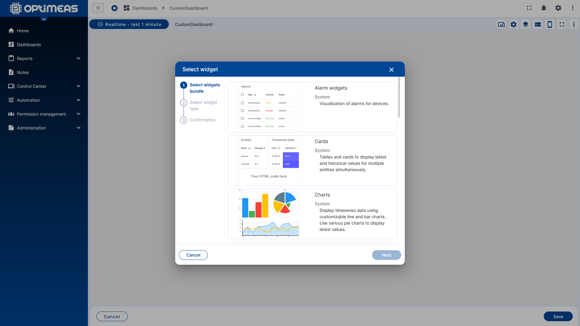
Add the first widget
Once at least one alias is available, the first widget can be added to the dashboard.
First, select a suitable package from the list of widget bundles.
Then, select the specific widget type within the bundle, such as a chart, table, map, or other visualization elements.
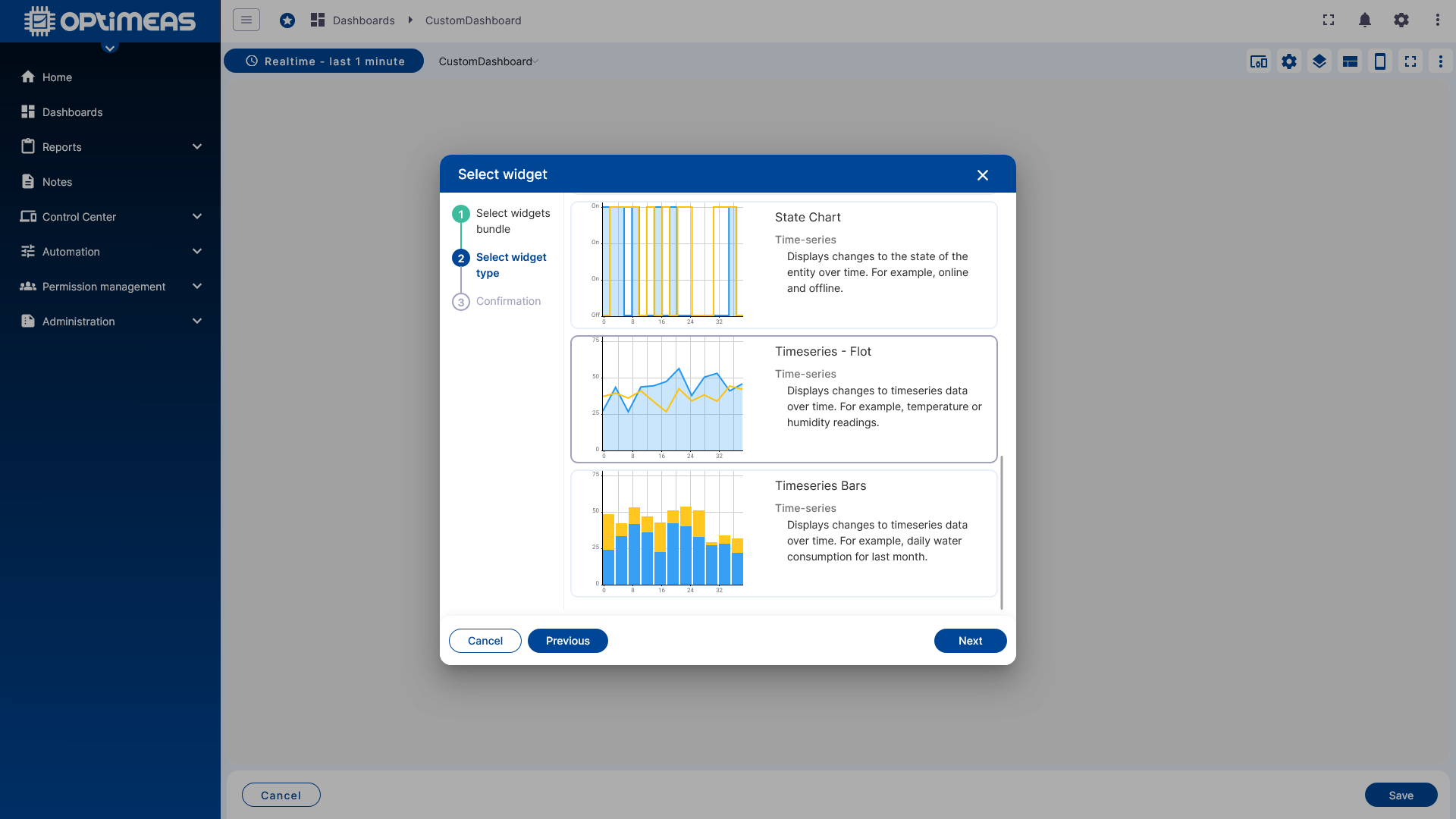
The widget configuration dialog then opens.
Widget Configuration
The configuration of a widget is divided into several tabs. Individual detailed options vary depending on the widget type, but the basic process is similar.
Data
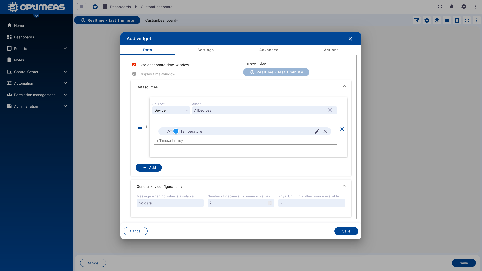
In the Data tab, you specify which data the widget should display or process.
First, you decide whether the widget uses the dashboard’s global time window or has its own time window. This custom time window works exactly like the global Dashboard Time Window with real-time or history mode and optional aggregation.
Next, select the data source:
- first the alias
- then the specific data channel or data key
Depending on the widget, one or more data channels and multiple aliases can be used.
Available data sources typically include:
- Telemetry from MQTT data
- Attributes
- Telemetry from OSF data
OSF data can only be used with the History time window. If only a single widget is to display OSF data, this widget must be assigned its own historical time window, even if the rest of the dashboard uses real-time data.
Data Key Configuration
Clicking the edit icon for an individual channel opens the detailed configuration for the respective data key.
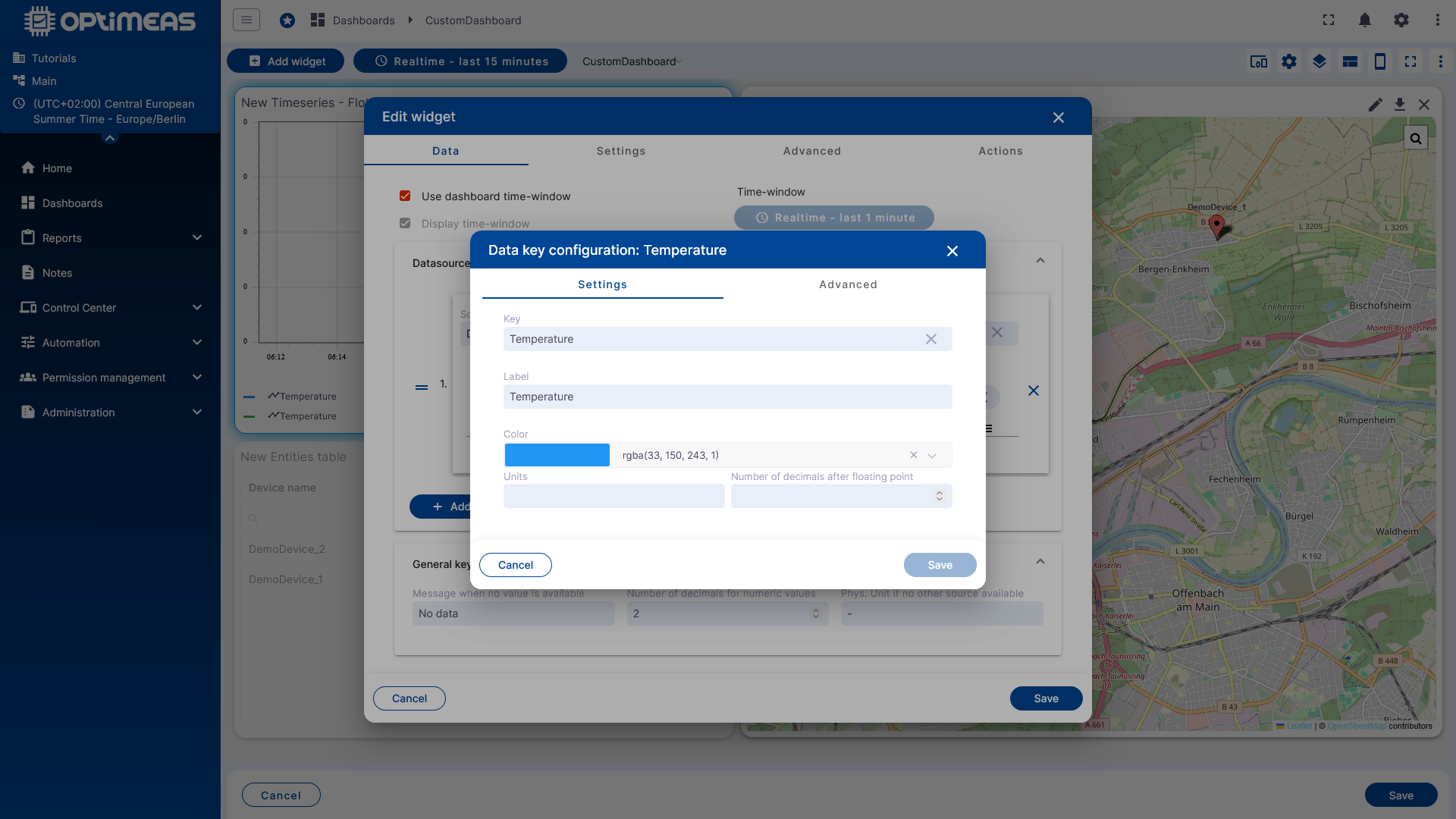
There, you can customize the following properties, among others:
- Channel label
- Color
- Displayed physical unit
- Number of decimal places
- Default values for missing data
- Additional display options
A post-processing function is also available. This allows you to modify how the data is displayed in the widget without changing the original data in the database.
Typical examples include:
- Conversion from Fahrenheit to Celsius
- Offset corrections
- Simple recalculations for the display
In the Advanced section of the Data Key configuration, the available options depend on the specific widget type.
General
The General tab is used to configure general display settings for the widget.
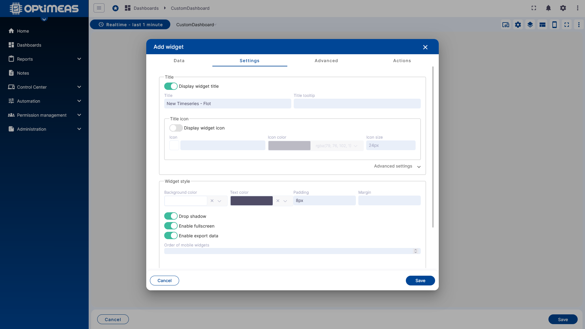
These include, for example:
- Title and title visibility
- Tooltip
- Icon, icon color, and icon size
- Background and text colors
- Inner and outer spacing
- Drop shadow
- Full-screen mode enablement
- Data export
- Legend settings
Widget-Specific Settings
The next tab contains the advanced settings, which depend on the selected widget.
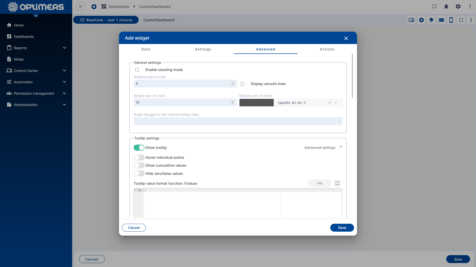
A chart widget offers different options here than a table, a map, or a control widget. This section therefore controls the specific behavior and appearance of the respective widget type.
Widget Actions
The last tab is where Widget Actions are configured. This allows you to define what should happen when users interact with the dashboard.
Among other things, actions serve as a navigation mechanism between different states of the same dashboard or between multiple standalone dashboards. However, there are also additional custom actions that enable functions beyond navigation. The available action sources vary depending on the widget. Actions can be configured both when creating a widget and later when editing it.
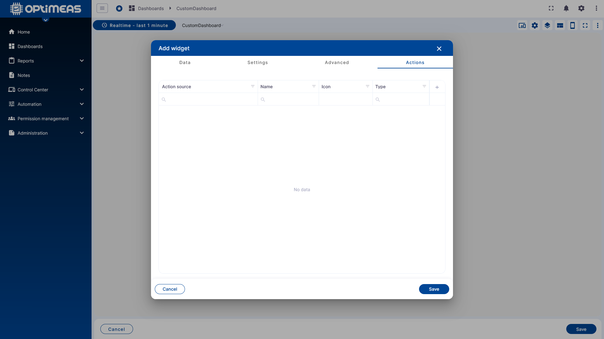
Available actions are:
| Action | Description |
|---|---|
| Navigate to new dashboard state | When the action is clicked, the dashboard switches to the state defined in the action. This occurs either by using the clicked device as a dynamic alias that is passed to the new dashboard state, or as a static switch without a dynamic alias |
| Update the current dashboard state | When you click the action, the currently open dashboard state is updated. This happens either by passing the clicked device as a dynamic alias to the current dashboard state, or as a static update without a dynamic alias |
| Navigate to another dashboard | Clicking the action switches to another dashboard. This is done either by passing the clicked device as a dynamic alias to the new dashboard, or as a static switch without a dynamic alias |
| Custom action | A custom action that is executed when the action is clicked (JavaScript) |
| Custom action (with HTML) | A custom action that is executed when the action is clicked (JavaScript + HTML) |
| Highlight Entity | (Applicable only in table widgets) Permanently highlights the clicked row of a table until a new row is clicked |
| Show on Map | (Only applicable in alarm table widgets with an integrated alarm map) Displays the device’s location on the alarm map at the time the alarm occurred. |
| Update Alias | Updates the currently defined alias with the function configured in the action |
| Navigate to previous Dashboard state | Navigates to the previous dashboard state |
This allows dashboards to be designed in a highly interactive way, for example:
- Clicking on a table row opens a detail view for the selected device
- A button jumps back to the home view
- A widget updates an alias via an action, thereby changing the rest of the dashboard view
Result
After saving, the widget is placed in the layout and can be used immediately or further customized.
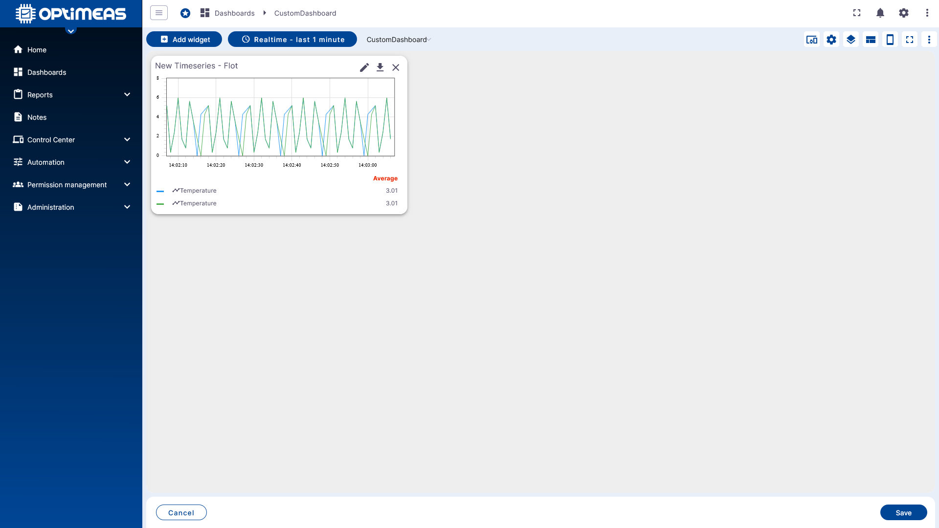
With multiple widgets, appropriate states, and coordinated time windows, this creates a complete dashboard interface.
Classification
Dashboards are the central interface for visual analysis and interaction in optiCLOUD. The true quality of a dashboard stems from the interplay of:
- clearly defined aliases
- sensibly chosen time windows and aggregations
- well-coordinated widget types
- dashboard states for navigation and context switching
- appropriate permissions via Permission Management
If standard widgets are not sufficient, custom widgets and widget bundles can also be developed in the Widget Library and used in dashboards.
Examples
For typical setups with multiple aliases, states, and widgets, there is a dedicated example collection: