Widget Library
Widget Library
The Widget Library is the central area for managing reusable widgets in optiCLOUD. Both the widgets provided by the platform and custom widget bundles are managed here.
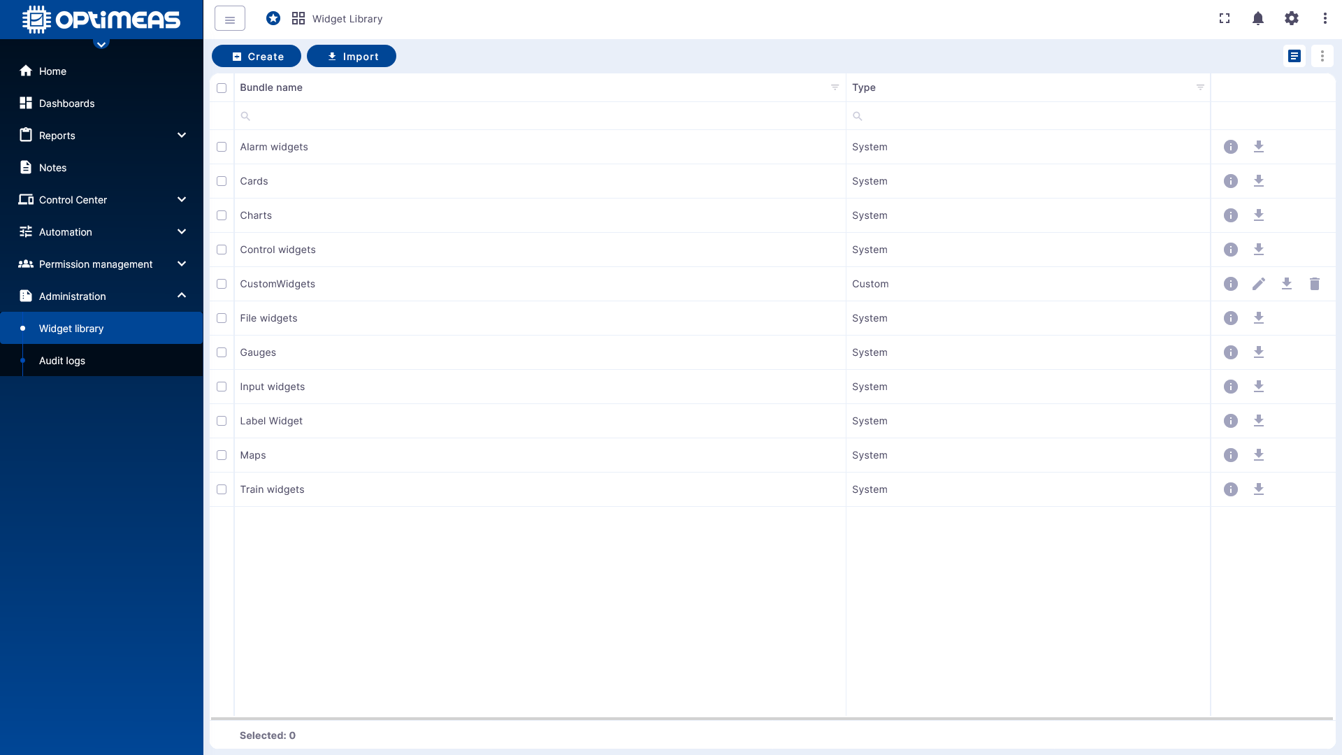
Widget Bundles
The table overview displays the available widget bundles.
- Bundle name Name of the widget bundle
- Type to distinguish between provided and user-defined bundles
There are two types:
- System for standard widgets provided by OptiMEAS
- Custom for widget bundles created by the user
New bundles can be created or existing bundles imported via the action bar.
Create a new widget bundle
Click Create to create a new widget bundle. First, assign a title. Optionally, you can also add an image and a description.
After creation, the bundle appears in the table and can be opened via the detail view. There, you can then manage the actual widgets within the bundle.
Create Widgets in a Bundle
Within a bundle, new widgets can be created using Create Widget. Before launching the editor, the desired widget type must first be selected.
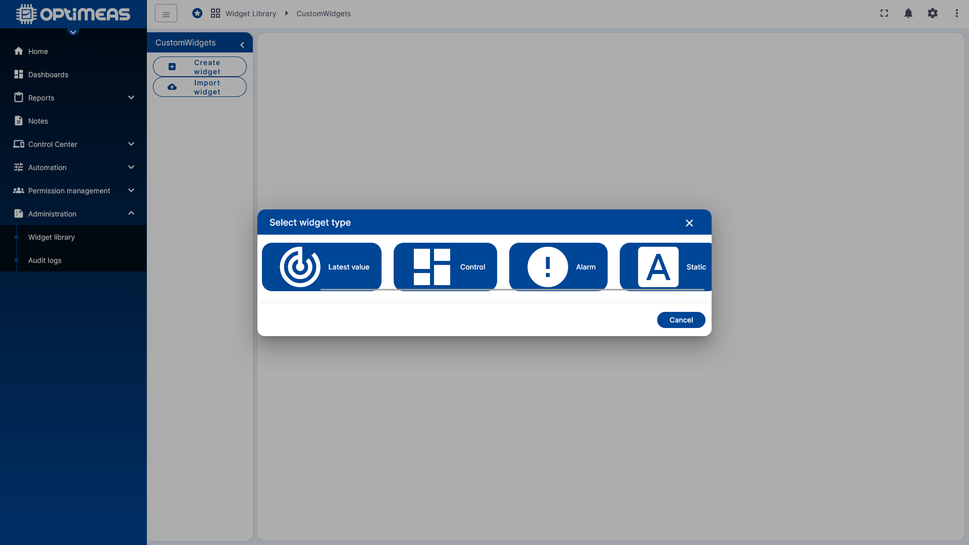
Available types are:
- Time Series Widget for time series data
- Latest Value Widget for latest measurement or status values
- Control Widget for widgets with control or RPC functionality
- Alarm Widget for alarm data
- Static Widget for widgets without a database connection
The choice of type determines the widget’s basic technical structure and, consequently, how data will be queried or processed later.
Widget Editor
After selecting the type, the Widget Editor opens. This functions as an integrated development environment for user-defined widgets. The individual editing areas are located on the left; a preview of the current widget is continuously displayed on the right.
General
In the General section, the basic properties of the widget are defined:
- Name
- Widget Type
- Preview Image
- Description
- General Settings
- Data Key Settings
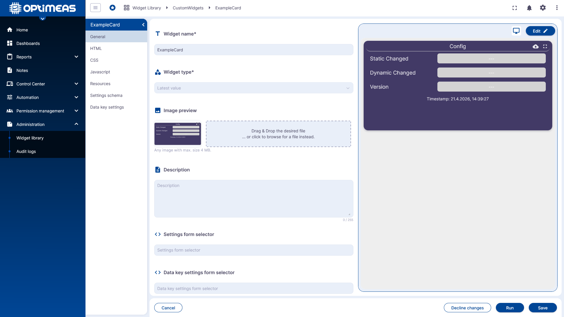
If a widget is to use its own settings, the default Settings Form Selector must be removed so that the widget can access its own definition.
HTML
The HTML section defines the widget's structure.
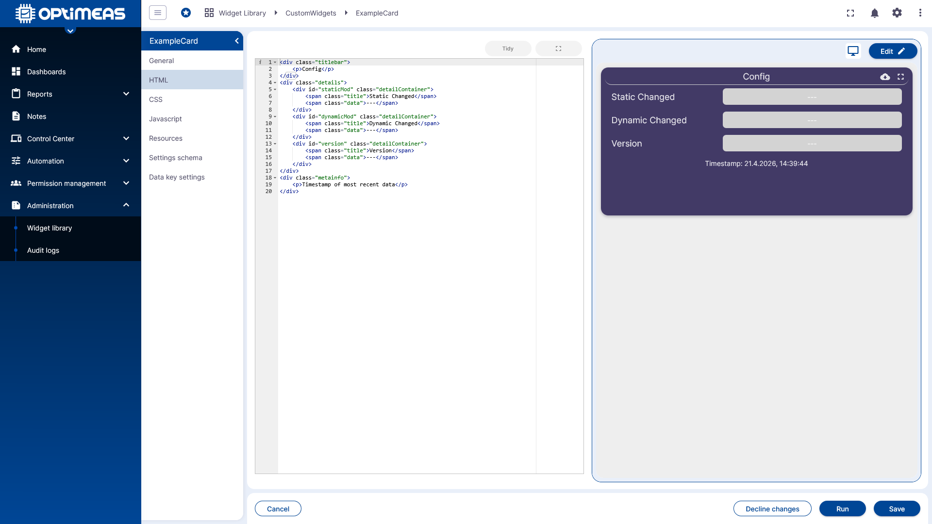
This is where the actual markup of the widget is entered, which is then immediately visible in the preview.
CSS
The CSS section is where the visual appearance of the widget is designed.
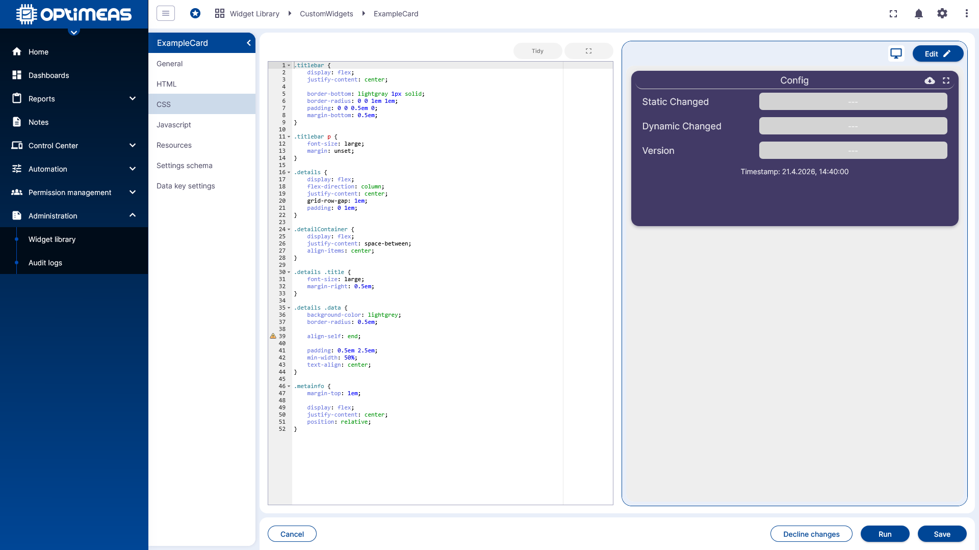
This allows you to implement layout, colors, spacing, and other style definitions directly for the widget.
JavaScript
The JavaScript section is where the widget logic is implemented.
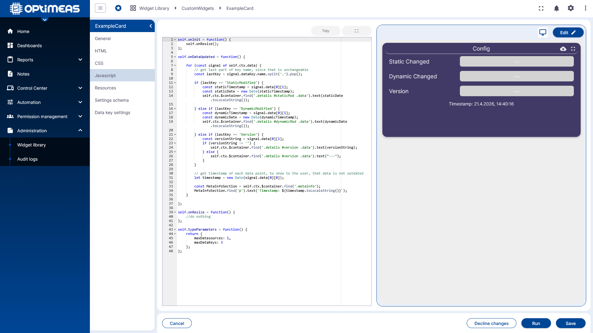
Here, data is processed, states are managed, and interactions and dynamic content are implemented.
Resources
Using Resources, additional external libraries can be integrated into the widget, such as visualization or utility libraries.
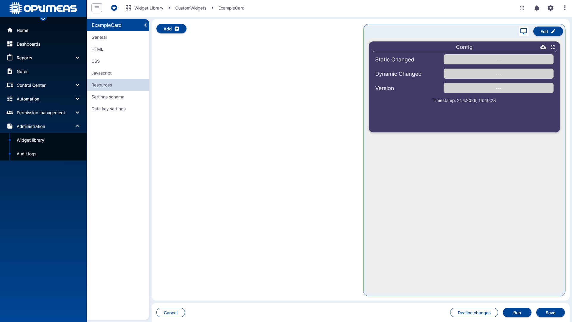
This allows you to create even more complex or specialized widgets based on existing libraries.
Settings Schema
The Settings Schema section defines which configurable settings the widget will later offer in the user interface.
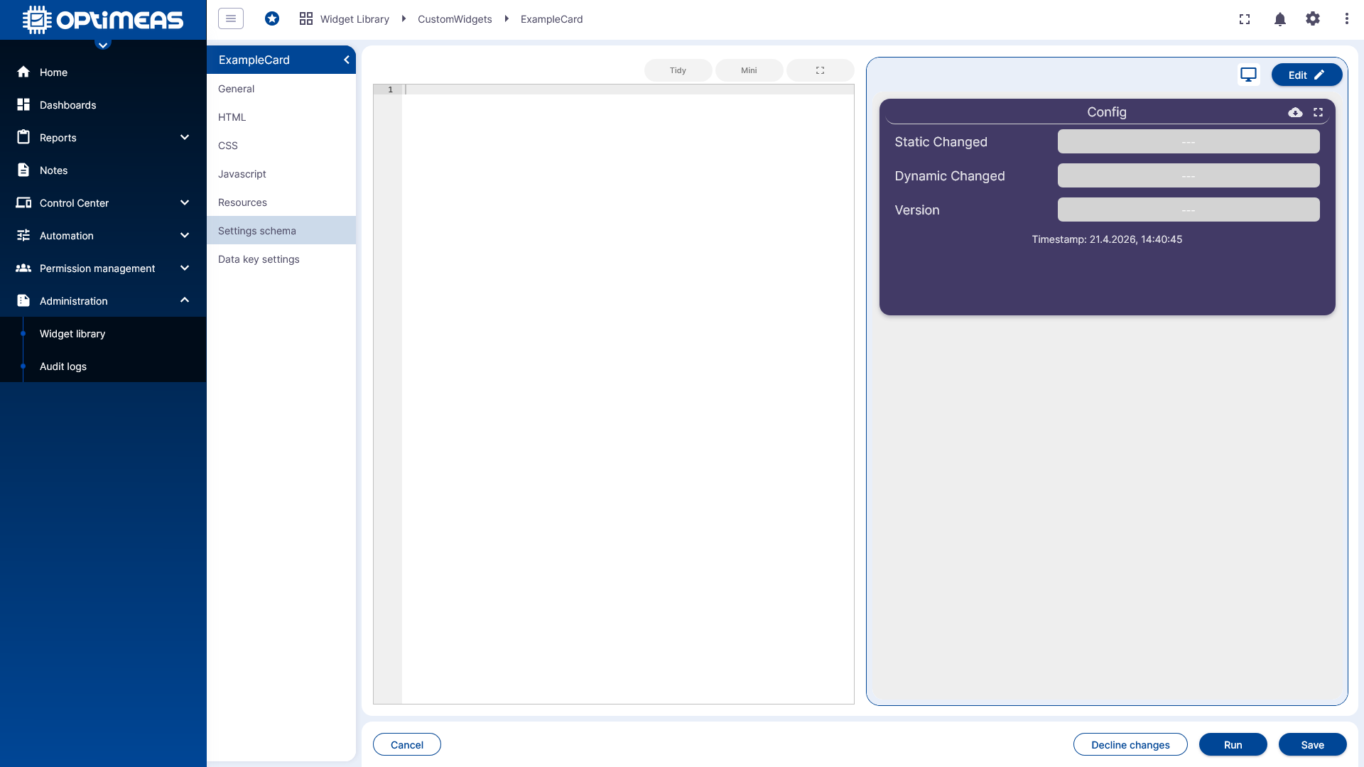
The schema thus describes the structure and input options of the widget configuration.
Data Key Settings
The Data Key Settings section defines how data channels or data keys are used and configured in the widget.
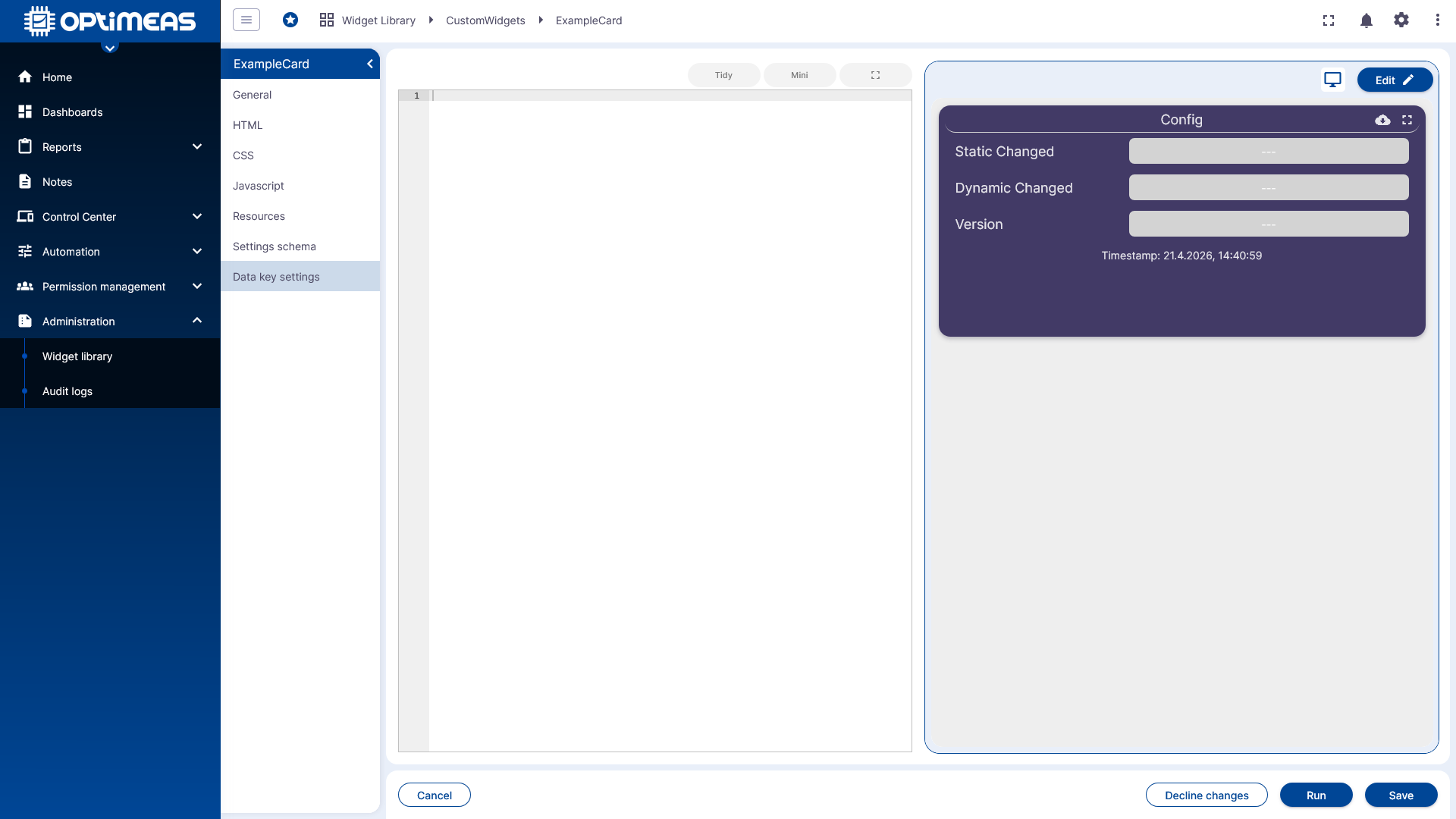
This allows a widget to be specifically prepared for certain data sources or data structures.
Widget Settings
The preview and configurable widget settings can be viewed directly in the editor.
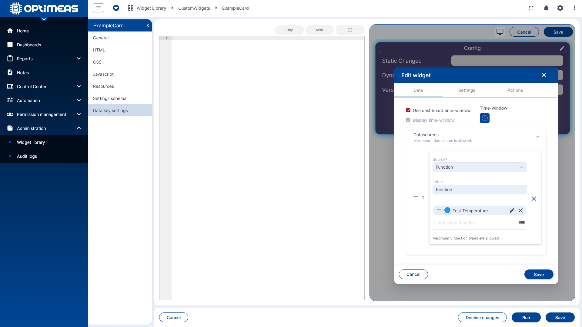
This allows you to quickly check during development how changes to the structure, logic, or settings affect the widget’s behavior later on.
Context
The Widget Library provides the technical foundation for reusable, custom visualizations within dashboards. The actual programming of complex widgets is described in more detail elsewhere. This page therefore serves as an overview of the management, creation, and structure of the widget framework in optiCLOUD.